
Here is a discussion on bitmap vs. vector file types and color sets.
Working in this industry heavily relies on the ability to provide solid product knowledge and providing information to make a project go smoothly. This often comes down to ensuring a design or logo starts on the right track by using the correct file type. Further, picking the right print/vinyl solution, and substrate (material surface) for the job.
Some of this is science and we can talk all the tech. we want, the other half is using the right programs and saving files in the correct formats.
"I'm sorry, the image you provided is not a vector"
- What does this mean and why do we need them?
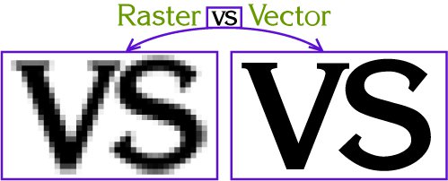
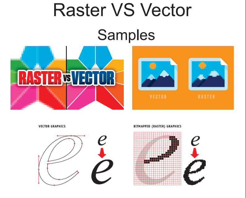
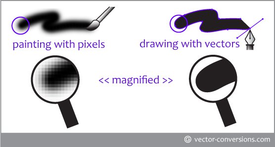
In short - a vector is the outline of an object, visualized by lines and nodes (to create curves). A dimension increase keeps the image intact, and no pixelation. Most commonly made in Adobe Illustrator or Corel Draw to produce a vector.
(.ai, .eps, .pdf, .cdr, svg)
A raster aka. bitmap, is an image that requires complex fills or gradients of multiple colors such as photos or details logos. The most obvious trait being when a dimension increase causes pixelation. Most commonly made in Adobe Photoshop, Paint, or any standard image editor.
(.gif, .jpg, .tiff, .png)
Simply put, if you want a clean looking die-cut that is "blade cut" by a plotter, it must be a vector file.
If you plan to enlarge a logo or design for various use and expect the quality to be perfect, it must be a vector.
If all you have is a bitmap/raster and you want a die-cut, it won't work. A .jpg can only be digitally printed with ink (see CMYK/RGB) to a vinyl that is white/clear, etc.
The file has to be converted to a vector (sometimes with a quality loss), or re-created in a vector-based program like Illustrator or Corel Draw. There are also free versions of vector software like Inkscape.
Color Theory
When it comes to color, there are multiple ways to provide a reference. Some work better than others, and typically depend on what your desired product will be.
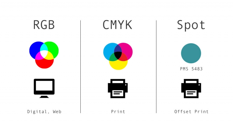
- CMYK - Cyan, Magenta, Yellow, Black - most common with digital printing, as there are physical ink cartridges for each colour.
- RGB - red, green, blue - most common with screen colours, given that a monitor or screen is typically just the adjustment of RGB pixels. Also converts reasonably well to CMYK.
- HEX - eg. #FF0000 - an HTML based color selection, meant specifically for website and screen work. Would have to convert to CMYK for printing
- Pantone (Spot) - a dedicated chart of colors used to cross-reference and ensure that machines are printing a "standard". Converts relatively close to CMYK for printing.
With these all noted, they can be converted from one to the other, but not always at a perfect rate. Meaning, a CMYK color of 97, 76, 25, 10 as it appears Blue, may not actually have an identical match in RGB, Hex or Pantone, so a close match is created.
Going from one to the other is never simple, so it's always good to find a colour you like (usually pantone) and then go from there to determine what is closest.
Given these discrepancies, when possible pre-colored vinyl films are used. Easier to flip through and select in-person with the naked eye. The tricky part is when a client provides an RGB or CMYK but we're trying to pick a blue that matches what we see on screen. Often times monitor calibration, printer calibration and what the human eye can see are totally different things, so the Pantone system is the best way to nail the colours to your printer and cross-reference an in-person swatch.
Plenty to digest, therefore if you're wondering we can help you out and answer all your questions.
